Brightening Photos Using the Brightness and Contrast Tool

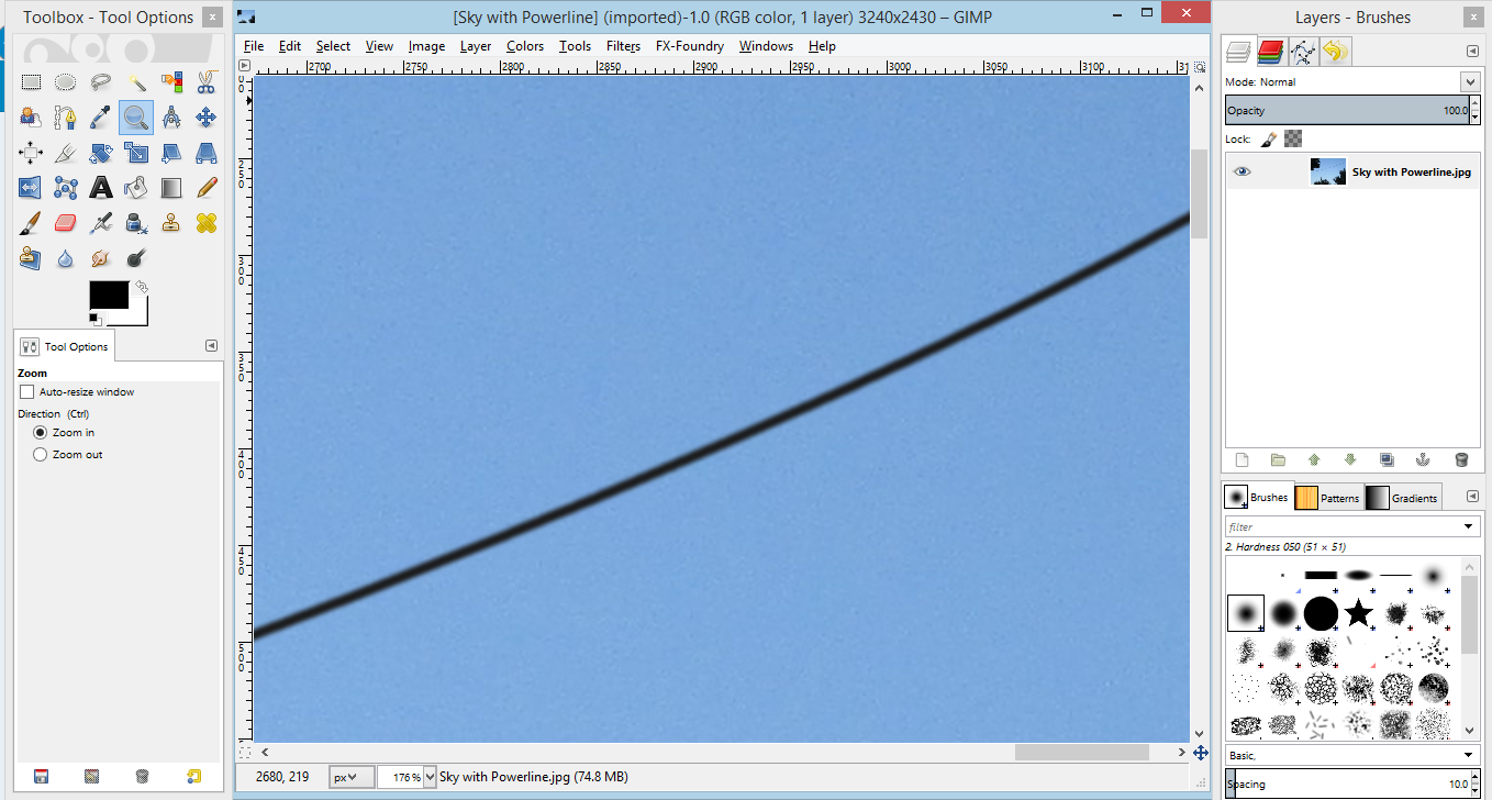
This is my next post in my series of pieces on editing photos using GIMP.  For a full list posts in my series on editing images or other topics, you may use the tag or categories list at the bottom of this post or check the “Curriculum” link on this page.  This post is about brightening up a too-dark photo using GIMP.  None of the tools I am using are unique to GIMP and can be found in other image editors.

Brightening an overly dark photo is extremely useful when improving the looks of your images.  It is rare to have full control over the lighting when you are taking pictures and it is very easy to take pictures that are too dark.  Many photo editors have automated filters that can be used to brighten a dark image, however they do not offer the level of control that manual controls do.  For this tutorial, I will be using the manual brightness and contrast tool on GIMP to adjust the brightness of the image.  GIMP includes other tools that can also be used to modify the brightness of an image that will be covered in a future tutorial.  When modifying the brightness of an image, it is important to modify the contrast of the image as well.  This prevents the image from becoming too washed-out.

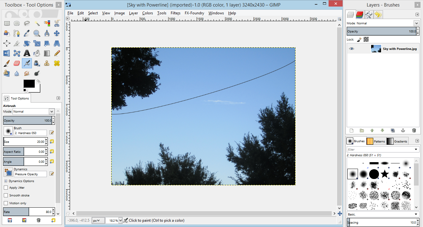
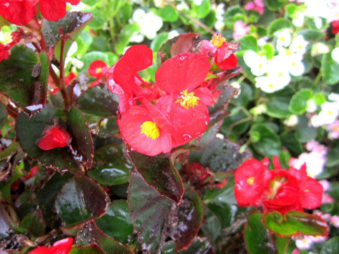
For this tutorial, I will be using a photograph I took outside on an overcast day that is far too dark.  If you would like to follow along on your computer, you can download the image below by clicking this link and saving it your computer, and try the tool for yourself on your download of GIMP.  Or you can use a dark picture in your computer to try the same techniques.

Red Flowers

Start by opening the image in GIMP.

There are two ways to open the Brightness and Contrast Tool.  Both start by selecting submenus from the menu at the top of the screen.  The first is by going through the “Colors” menu and then selecting “Brightness Contrast”.  The second method is by selecting “Tools”, followed by “Color Tools” and lastly “Brightness Contrast”.  In either case, you open the Brightness Contrast tool.

Capture

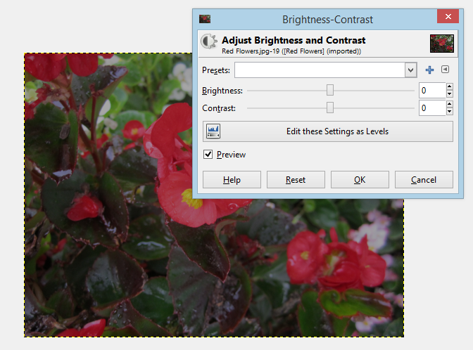
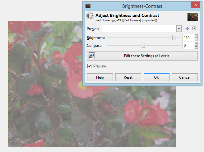
As you can see, the tool has two sliders, one controlling brightness and the other controlling contrast.  Moving the brightness slider in a positive direction (to the right) brightens the image, and moving it in a negative direction (to the left) darkens the image.  The same applies to the contrast slider, with movements to the left decreasing the contrast and movements to the right increasing it.  The “Edit these Settings as Levels” button opens another dialogue that allows for more sophisticated manipulation.  We will be covering the use of the Levels tool in a later tutorial.  The preview checkbox should be checked.  This allows you to see the effects of your changes on your image as you make them.

I suggest starting off by playing with the controls a bit.  Try setting brightness to a high number while leaving contrast the same.  See how washed out and gray the image looks.  That is because brightness simply lightens the colors uniformly.  Even photographs taken in bright light have dark areas, which is why modifying brightness and contrast together is important.

Capture
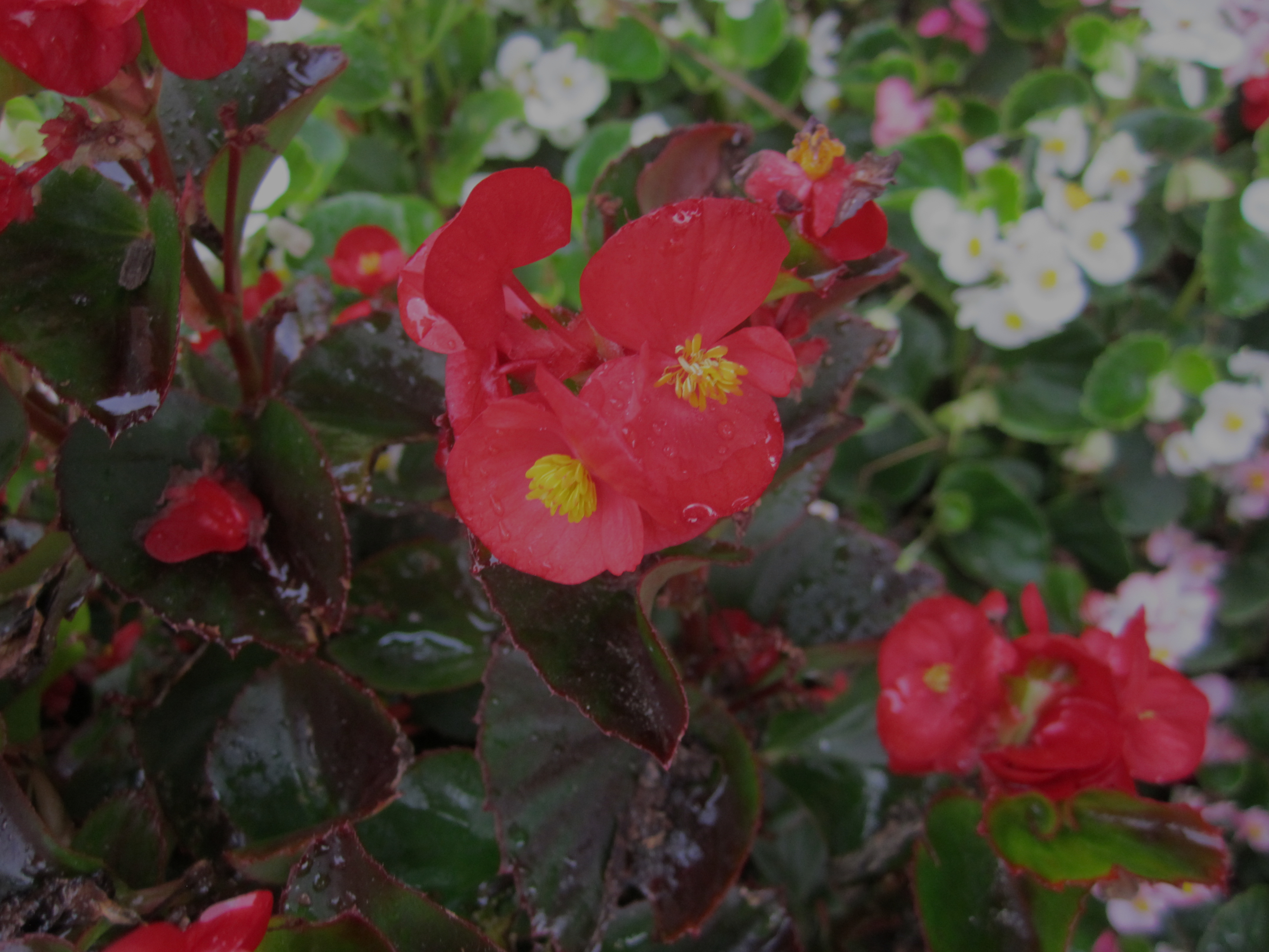
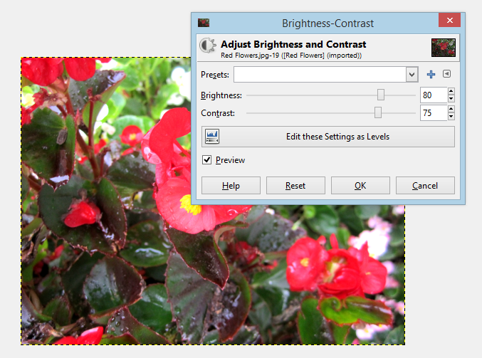
Every image is different and there are no universal settings that will give you the perfect effect.  When working with your own images you need to experiment a bit to find the best values.  For this picture, I like a vibrant, high contrast look, so I set the brightness to 80 and the contrast to 75.  Try those values and see how you like them.  If you don’t, keep looking until you find values you like and then click “OK”.

Capture

And that is all there is to it.  Your picture is ready to use or edit further.

I hope you enjoyed this tutorial and post ideas for future ones in the comments!

What is a Vector Graphic?

Two terms you will encounter frequently when you discuss creating images on a computer are “vector” and “bitmap”.  Both are types of image and both have distinct uses.  You have probably encounter both types many times without noticing.  The primary difference between the two types is how the information is stored.  This difference leads to several important distinctions in how the images appear and how they are used.

In a bitmap image, which is sometimes called a raster image, the picture is in the form of pixels.  Each pixel is in a specific location and is a very specific color.  For example, a digital photograph consists of thousands of tiny squares which create images.

For example, just look at this photograph of some purple flowers.  It consists of approximately, 800,000 pixels and when you zoom in on it tightly you can see them.

Purple Flowers

Just look at this very tight close up on one of the flowers.  You can see around the edges of the flower where the pixels are visible.

Capture

All bitmaps store information in the form of pixels.  This has the advantage of being able to support very detailed images, that have realistic color variation.  However, this can also be a disadvantage.  As you can see, when you zoom in tightly on a bitmap, the you see individual blocks of color.  This is why there is often a limit on how much you can enlarge a photograph before it begins to look odd.  This is also why measurements like “dpi” or “ppi” (which stand for “dots per inch” and “pixels per inch” respectively) are relevant.  The more pixels in one inch, the more you can enlarge the image before it starts to look strange.

Vectors graphics work on a completely different principle.  Rather than storing the image as individual pixels, it stores the image mathematically.   Vector images are understood in terms of points, curves and mathematical formulae.  This allows for the storage of extremely complicated shapes.  For this reason, vectors are very scalable.  To increase the size of the vector image, simply adjust it mathematically and the image will be unchanged.  Vectors are excellent at shapes and designs.  They are frequently used in logos and drawings.  However, they do not work well for subtle color variation or photo realism.  Vector images often look like drawings or have a “cartoony” look.

For example, here is a very roughly created image of a similar flower.  It consists of five round shapes, each with a few additional points to give them more “petal” like appearance.

Capture

Obviously, this is a very crude graphic, but it does a good job of illustrating some of the characteristics of vectors that might not be as obvious in a more complex drawing.  Each “petal” is defined by six nodes and each node two other points determining the curve of the line connecting it to the next node.  The center of the flower is simply an ellipse.  However, because the shapes are defined by curves, when you zoom in, there is no change in the image.  You can zoom in as tightly as you like or increase the size of the image and the curves do not change.

This is a zoomed in look at one of the petals.  Notice how it keeps its shape and color.

Capture

Both bitmaps and vectors have many uses.  I enjoy working with both.

I hope you liked reading this article and please post your questions in the comments!

Note: Most webpages, including this one, prefer to handle bitmaps rather than vectors.  All of the vector images in this post were converted into bitmaps for viewing.

Photo Editing Using the Clone Tool

This is the first post in my series on editing photos using GIMP.  For a full list posts in my series on editing images or other topics, check the “Curriculum” link on this page.  This post is about fixing problem areas in a photograph by using the clone tool in GIMP.  Other photo editors have similar tools, but for simplicity I will be demonstrating using GIMP.

The clone tool is one of my favorites for editing images.  How many times have you taken a photograph, but had something unfortunate sitting in it?  I will be demonstrating with an image of a blue sky with a power line stretched across it.  The clone tool is excellent for fixing this type of problem.  The clone tool copies the pixels from one spot on the image, called the “sample”, and allows you to place them anywhere else on the image.  You can cover up the problem by replacing it with small sections of other parts of the picture.  However, it does have some limitations.  It works best at filling in areas surrounded by the same color.  You cannot use this tool to fill in details, like faces or patterns.  It works very well for removing the piece of lint on someone’s clothing or a fly on the table.

If you would like to follow along, you can download the image below by clicking this link and saving the image to your computer, and experiment with cloning using your download of GIMP.  Or you can use a picture in your computer to try the same techniques.

Sky with Powerline

First, open the image that you would like to work with in GIMP.

Capture

This picture is an excellent candidate for using the clone tool, because the cable is surrounded by sky that is all roughly the same color.

Next, zoom in tightly on a part of image with the power line.  You can do this by selecting the magnifying glass icon in the tool box and clicking on the image or by pressing the Z key on your keyboard.  The program zooms in by default, but you can switch to zooming out by pressing and holding the Ctrl key while clicking.

Capture

Here is a zoomed in version of the same image.  You will notice that the magnifying glass is selected, and that it is set to zoom in.

Then select the clone tool.  You can do it by clicking the small icon that looks like a stamp, or by pressing the C key on your keyboard.

Once you have selected the clone tool, you need to set a source.  This is where you will be copying from.  For this picture, you want to set your sample in the area of blue near the power line so that when you remove it, it is replaced by the same color of blue.

CaptureThis is the tool options dialogue, where you set the size of the cloning brush. It will appear on the lower left-hand side of your screen, below the toolbox.  I prefer smaller sizes, and brushes with some transparency on the edges, but that is a matter of personal preference.  For this lesson, I will stick with the defaults.  However, you may wish to experiment with larger or smaller or different shaped brushes.

Once you have picked a brush that you like, hold down the Ctrl key, and click on the location on the picture you would like to copy from.  There will be a dashed area surrounding the sample location.  For my first section, I am going to take a sample from the area within the orange circle.

Capture

I am going to use that sample to fix the area immediately below it.  Once you have your sample, just click on the area you want to copy.  It may take a few clicks to fully erase a bit of the line.

Capture

This is what it looks like after the first bit of power line is removed.  Because I am using a fairly small brush, it took five or six clicks to remove a space that size.  However, notice how nicely the removed area blends into the sky behind it.

Once you have fixed a small area, move your sample location and start working on the next spot.  To move your sample, just hold down Ctrl and click on a new location.  Move your sample often.  It is not obvious, but there are significant color shifts due to lighting even on what you would think of as a surface that is only one color.

Also, if you click and drag your cursor, the sample moves with it.  Try it out.  Set your sample and then click and drag your cursor across the power line.  The sample moves with it.  This is useful in some cases, but may not always work, particularly if you are working  with a background that has distinct areas of color.

You can repeat what we just did until the entire power line is erased and all you have is a clear blue sky.

Sky with Powerline

How did yours turn out?

Using the cloning tool takes a bit of practice, but is a very easy way to do simple fixes on photos.  I hope you enjoyed this tutorial, and please post questions in the comments section!

Image Creation and Editing Introduction

This post is the introduction to a larger topic on photo editing.  I will be talking briefly about my preferred tools for working with photos and where to find them.  I will be posting many short how to pieces on doing particular tasks using a photo editor in the future.  For my first tutorials, I will be focusing on using an editor for specific tasks, for example, brightening a photo, removing a bad spot, or fixing the color.

My prefer using open source software over commercial versions for demonstrations.  It is easy to find and widely available.  For my photo tutorials, I will be using GIMP which is an open source version of Photoshop.  You can download it here.  It is my favorite software for working with bitmap images.  For working with vector graphics I prefer Inkscape, which is an open source version of Adobe Illustrator.  You can download it at this link.  For my discussion on what vector graphics are, and how they differ from bitmaps, please click on this link.

For my photo editing tutorials, I am including an image for you to manipulate.  You may download the image and follow along on your own computer.

I hope you enjoy my tutorials!